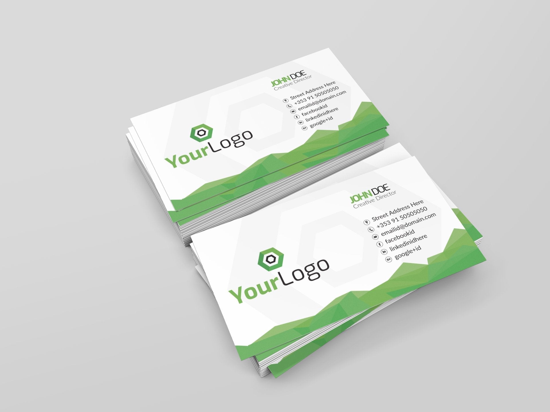
As per recent studies, about 72% of people judge an individual or a brand based on the quality of their business card. Sounds shocking, right? Although most people in Ireland undermine the significance of business cards in the digital era, the truth is they are often the first impression people have of your brand, so getting them printed the right way is crucial. No matter if you are a small business, a corporate giant, or an individual proprietor, even a small design mistake in your business cards can leave a lasting negative impression. This is why, here we are with some common mistakes associated with business card printing in Galway, Ireland that you must avoid at all costs.
#1 Overcrowding Your Card
One of the biggest mistakes people make is trying to cram too much information onto a tiny card. When it comes to business cards always remember that less is more. Your business card isn't your brochure; it's a quick introduction. So, ensure you have just the following info on the card:
- Your name
- Your title
- Company name
- Contact information, and
- Maybe a tagline or social media handle
When you overload the card with too many details, it can make the card look cluttered and difficult to read. So, here whitespace is your best friend because it allows the important information to stand out with a clean, professional look.
#2 Selecting the Wrong Font
The font you select can say a lot about your brand, and using the wrong font can hurt your image. Never go for fonts that are too decorative, hard to read or unprofessional because they can give the wrong information. Instead, stick to clean, legible fonts that match your brand's tone. Also, don't use too many different fonts on one card because one or two fonts, at most are enough to maintain consistency and avoid confusion.
#3 Skipping High-Quality Materials
The texture and thickness of your business card can have a surprising impact on how people perceive your brand. A flimsy card made from low-quality paper can feel cheap and give the impression that your business isn't well-established. On the other hand, a card made from high-quality materials feels more substantial and can make your business seem more credible and professional. Invest in good quality paper or consider unique finishes like embossing or foil stamping to add a touch of class to your business cards.
#4 Poor Use of Color
Colour can make your business card stand out, but poor colour choices can backfire. Shades that are too bright or clash with each other can make your card difficult to read or visually overwhelming. It's best to stick with your brand's colour palette for consistency. Also, be mindful of colour contrast because you need to ensure that the text on your card is easy to read against the background.
Other Business Stationary Products you may like:
Conclusion
These are the mistakes that you can avoid when you invest in business card printing in Galway, Ireland for yourself or your brand. However, if you don't know where to start, or are still unsure that you cannot avoid these mistakes, feel free to reach out to the printing professionals at Jaycee. They have been printing business cards for years, and instead of you telling them what to do or how to avoid mistakes, they can do the work seamlessly without any flaws.
Want to print business cards that will remind people of you positively every time they pull the card out of their pocket? Contact the team at Jaycee today!

